At ByteDance, I helped establish the GIP UED Creative Design Lab and led a study of visual comfort in digital products. The handbook translated research into practical guidance for teams working on Douyin, Xigua Video, Jinri Toutiao, and other applications.
“Why is it designed this way?
”
The lab was created to connect design decisions with the reasoning behind them. This project explored viewing distance, text size, color, contrast, and screen use.
This case study summarizes the design work. The original internal handbook is not available publicly. Device calculations below describe the assumptions used in that project.
Visual Fatigue
Long periods of screen use can cause temporary discomfort such as dryness, tired eyes, and blurred vision. The design question was how to make interfaces easier to read and support more comfortable use.
Causes of Visual Fatigue
Near Response
Looking at a nearby object involves accommodation and convergence. For interface design, this makes viewing distance and readable text size important considerations.
- Accommodation changes the lens's focus for near objects.
- Convergence turns the eyes inward so both can focus on the same object.
Light Intensity
A bright screen in a dim room, glare, or reflections can make viewing uncomfortable. Screen brightness should suit the surroundings, and interface transitions should avoid abrupt changes in luminance.
Highly Saturated Colors
Highly saturated colors can compete with text and make hierarchy harder to follow. The study explored calmer background colors while keeping enough contrast for important content.
Vibration
A moving device makes small details harder to follow. Interfaces intended for use in motion need larger, simpler content and appropriate interaction targets.
Ways to Relieve Visual Fatigue
Viewing from a Distance
We used “design viewing distance” to describe the distance at which an interface should be evaluated. It combines the viewing task, device size, input method, and practical reach of the user.
For the handheld example in this study, we used 40 cm as a design reference. It was a project assumption rather than a universal minimum for every screen or person.
We also explored the visual angle of a logical pixel. The calculations below use an assumed angle of 1.5/60 degrees to compare device size and logical resolution.
The model estimates a reference viewing distance:
- L is the diagonal size of the screen.
- H is the screen height in logical pixels.
- W is the screen width in logical pixels.
- d is the assumed visual angle, set to 1.5/60 degrees in this example.
Within this model, a larger screen or lower logical resolution increases the reference distance. It provides a design comparison, which still needs to be checked with real users and devices.
Casting content to a TV or projector changes both the viewing distance and the interaction. A handheld device can become the controller while the larger screen carries the content.
We called the distance allowed by the input method the operable distance. Touch, a keyboard and mouse, and a remote control each create different constraints.
We used presence distance to describe how the image fills the viewer's field of view. This was another input to the layout model, rather than a promise of fatigue-free viewing.
Comparing these distances helped us choose a reference for prototypes and usability tests, particularly on devices that designers did not use every day.
For the study's iPhone X landscape example, the model produced:
- Reference viewing distance: 38.07 cm.
- Operable distance: 49.50 cm.
- Presence distance: 20.77 cm.
We selected 40 cm as the design viewing distance for that example.
Real Cases:
After releasing the handbook, we worked with product teams to apply the ideas, especially in online education.
We helped GuaGualong refine its viewing-distance reminders and contributed to visual-comfort design validation for Dali desk lamps.
 There is a prompt in the Guagualong app if a child is too close to the screen.
Comfortable Font Size
Viewing distance also changes the text size a design needs. We used the model to check familiar mobile interfaces and to explore less familiar formats such as large displays.
In our PingFang Regular example, a stroke thickness of 1 pt corresponded to a font size of about 14.5 pt. Font family, weight, display characteristics, and the reader all affect the result.
To adapt that reference size to the selected design viewing distance, we used the following ratio:
- Ddv is the design viewing distance.
- Dec is the eye comfort distance.
- Sec is font size at eye comfort distance.
With the example distances of 38.07 cm and 40 cm, the model gave a text size of 15.12 pt. We rounded up to 16 pt for the prototype.
Readers have different needs. Rather than assume one size works for an age group, interfaces should support text scaling and be tested with the people who will use them.
Contrast matters alongside size. WCAG 2.2 specifies at least 4.5:1 for normal text and 3:1 for large text at Level AA.
Real Cases:
We tested the approach across ByteDance products and helped teams make text sizing and contrast more explicit parts of their design process.
 I helped Xigua Video create a new font system.
For the pre-K product line, the resulting body-text specifications were 19 pt on iPhone, 22 pt on iPad, and 22 pt on Android. These values reflected that project's users and device distribution.
 We helped to check the font size of the text in the pre-K app.
Breaks from Near Work
The American Optometric Association recommends regular breaks using the 20-20-20 rule: every 20 minutes, look at something 20 feet away for 20 seconds. An optional reminder can support this habit without interrupting the user unnecessarily.
Break reminders should be easy to dismiss, pause, and configure. Their purpose is to support the user's routine, rather than add another obligation.
Appropriate Light Contrast
Evaluate the screen in the environments where it will be used. Reading, working, and settling down for sleep create different lighting needs.
Respect the device's automatic brightness controls where available, and test the interface at both low and high screen brightness.
Other apps and screens form part of the viewing environment. Keep related surfaces consistent so switching between them does not create a sudden flash of light or dark.
Display flicker depends on the hardware and brightness setting. Test on representative devices rather than assuming one frequency or brightness recommendation applies to every OLED screen.
Real Cases:
In reading products, we found that switching from a dark reading surface to a white page could create an abrupt brightness change. Keeping the surfaces aligned, or using a brief transition where appropriate, made the change less disruptive.
Low-saturation Colors
Reserve strong saturation for elements that need emphasis. For large surfaces, compare quieter alternatives and check their contrast with the content.
Offer light and dark themes and follow the system preference by default. Give people a way to choose the theme that suits their surroundings.
Both themes need readable contrast. Avoid sudden changes between unrelated light and dark surfaces during a task.
Real Cases:
For children's products, we worked with designers to reduce excessive saturation while preserving the visual identity and readability of each app.
 After: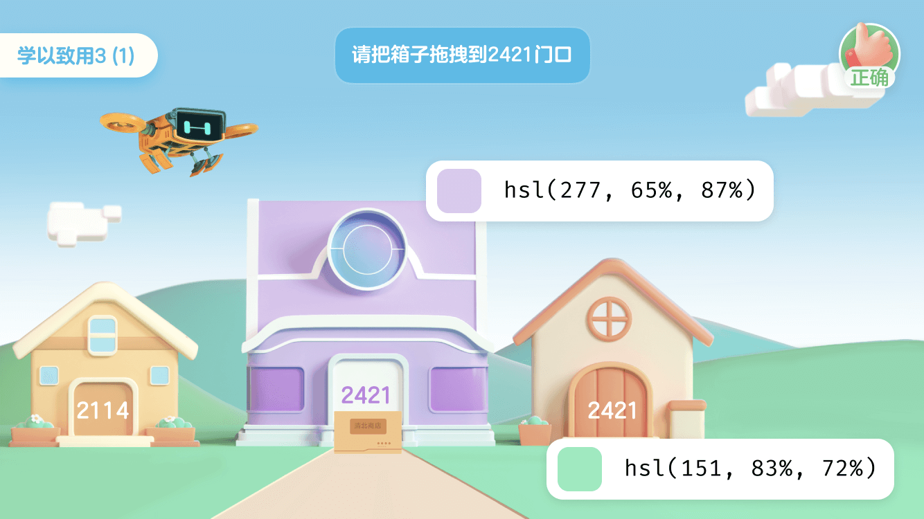
Keep the Screen Still
For interfaces used while moving, increase the clarity of text and controls. Motion detection should only support a clear user need, and any reminder should be gentle and optional.
Blue Light
The original study also explored warmer display colors. Current evidence does not establish that blue light from ordinary digital-device use damages the retina. Evening light exposure can affect sleep timing; visual comfort and sleep are separate design concerns. See the American Academy of Ophthalmology.
Exploring Warmer Display Colors
Hardware Filtering
Blue-light filters change the spectrum reaching the eye, but that alone does not demonstrate a benefit for digital eye strain. Our interface work focused on the resulting color, brightness, and contrast changes.
Screen Reduction
Warmer interface colors can support a night-mode preference. Check the complete palette so that text, images, and controls remain distinguishable after the change.
The study explored applying a warmer color layer to images. Its temperature values were prototype choices, which needed to be evaluated with the content and display in use.
 I created a SwiftUI prototype of screen reduction of blue light to help understand how it works.
A GPU-based implementation can also adjust the rendered colors. The design still needs to preserve contrast and communicate the setting clearly.
Uniform Contrast
Changing a surface's color temperature changes its luminance and its relationship with surrounding elements. Recheck contrast after applying a warmer palette.
For a light background, adjust foreground colors together with the background instead of adding a tint to the entire interface and assuming the original contrast remains.
Real Cases:
Some apps placed an orange layer over the screen, reducing text contrast. We explored adjusting the text and blending method together to keep the content readable.
 After: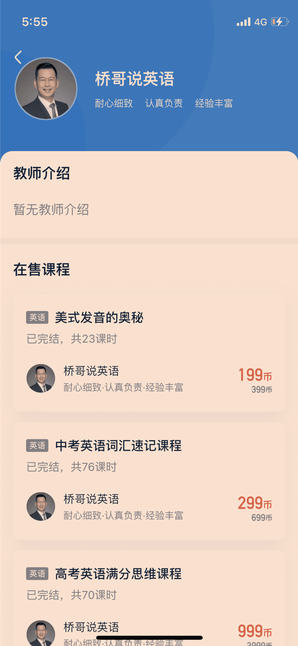
Circadian Rhythm Compliance
Evening light exposure can affect the body's sleep–wake cycle. A warmer display is one possible preference, and it should be considered separately from claims about preventing eye disease.
For scheduled color changes, follow the user's device settings and routine. Make the transition gradual, allow manual control, and avoid treating a fixed sunset offset or color temperature as a universal health requirement.